Starbucks Style Guide
Starbucks Shield Guidelines
Introduction
The “We Proudly Serve” (WPS)
Logo and What It Represents
We are pleased that you have chosen to serve
Starbucks® coffee or beverages to your
customers, and delighted that you wish to use
your time and resources to promote our coffee.
To help you, Starbucks Coffee Company has
created the Foodservice Marketing Tool Kit,
complete with promotion suggestions as well
as customizable brochures and other templates.
If you find a need for custom marketing that is not
addressed in the tool kit, we offer these guidelines
to assist you in the development of artwork that
supports both your business objectives and Starbucks
branding objectives.
Note: Whether you customize templates from
the Foodservice Marketing Tool Kit or design
your own art, remember that Starbucks must
review and explicitly approve all artwork
prior to production. Please email all artwork
submissions to: fsmarketing@starbucks.com
or fsmarketingcanada@starbucks.com.
This is to ensure you’re getting the full advantage
of your association with Starbucks Coffee Company,
as well as help you avoid any incorrect and/or
inappropriate usage of the Starbucks “We
Proudly Serve” logo and brand identity. For
further details, please see the Approval Process
on page 10. Note also that the Starbucks Coffee
logo may never be used independent of the
“We Proudly Serve” text.
Starbucks Coffee Company reserves the right to
decline usage of the Starbucks name or brand
representation in any situation the company deems
inappropriate for any reason even if the WPS logo
usage meets these guidelines. Please remember that
anything Starbucks doesn’t expressly approve in
writing is considered not approved. Starbucks Coffee
Company may also require you to recall and/or reprint
any marketing materials that do not meet with Starbucks current
brand standards.
 Elements
Logo Variations
The primary WPS logo is composed of the
Siren symbol and the phrase “We Proudly
Serve.”
Siren symbol and the phrase “We Proudly
Serve.”
The WPS wordmark is composed of the
phrase “We Proudly Serve” locked up with
the Starbucks wordmark. It always appears
vertically reading upward, and should have
a TM symbol.
Logo Color Variations
Consistent adherence to the color guidelines
association with the brand.
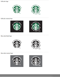
Full-Color Logo
In the preferred use of the primary WPS logo,
the logo is Starbucks Green and white and is
placed on a white/light-color background.
Full-Color Reverse Logo
Use when background color or imagery adversely
affects the legibility of the wording. Note that
background color or imagery cannot appear
through the WPS logo nor can the logo be altered
in any way including, without limitation, to make it
fit any theme, ambiance or external environment.
The WPS logo can only be used as shown here.
One-Color Black Logo/One-Color Reverse Logo
Use is limited to one-color or two-color printing where
Starbuck Green is not available.
Color Print Specifications
Color Specifications
Print the primary WPS logo in its three correct colors:
- Starbucks Green
- Black
- White
Pantone® 3425 C. Do not use any other green.)
Print on uncoated stock, matching
Pantone® 3425 C ink to coated hue. No other
colors may be substituted. The Starbucks logo on
any other material must visually match Pantone® 3425 C.
If you are unable to print in color, or if you are unsure that
you can visually match to Starbucks Green, you must print
in two-color black and white, or black only on a white
background. No other colors may be substituted.
PANTONE, Inc., and may not match the PANTONE
Color Standards. PANTONE is a registered trademark
of PANTONE, Inc.
Note: For consistent color reproduction, always
match to Pantone® solid-coated swatches.
Logo Clear Space and Minimum Size
Clear space frames the logo, separating it from
other elements such as headlines, text, imagery
The clear space indicated is the minimum.
Whenever possible, allow more than this amount
of clear space.
Primary WPS Logo
Minimum clear space is at least 2X, where X
equals the distance from the side of the Siren
symbol to the widest part of the logo.
WPS Wordmark
Minimum clear space is equal to 150% of the
height of the “B” letterform.
How Small Can I Go?
In the primary WPS logo, the Siren symbol should
be no smaller than .35" (9mm) width, while the
word Starbucks in the WPS wordmark should be
no smaller than .5" (13mm) height.
Primary WPS Logo with the Operator's Logo
The primary WPS logo should be 1/3 of the
operator logo size for pieces 8.5"x11" and
under. The primary WPS logo should be . of
the operator logo size for pieces larger than
8.5"x11". This helps reinforce the relationship
(e.g., it’s Joe’s Café first and Starbucks plays a
supporting role).
Note: The trademark and registration marks
scale independently of the symbol/wordmark
when enlarged or reduced dramatically. For
smallest print size, set registration marks in
Avenir Regular 4pt.


